Components
For any clickable area, such as interactive lists, the recommended minimum height is of 40 px. This allows for adequate accessibility, especially when using Qatium from touchscreen devices like tablets.
- Lists should be short and easy to read at a glance.
- Avoid repetitive copy in lists.
- We use two types of lists: accordions and contained lists.
Accordion list
Section titled “Accordion list”- The accordion component extends the length of the plugin and pushes down the surrounding panels in the UI.
- It’s a good practice to use it in long lists or in lists with content that doesn’t need to be visible at all times.
- It provides lots of information in a small space by progressive disclosure. The section title gives the user an overview of the content, allowing them to decide which sections to read.
- Fill accordion lists in the Grey 500 color in the default state.
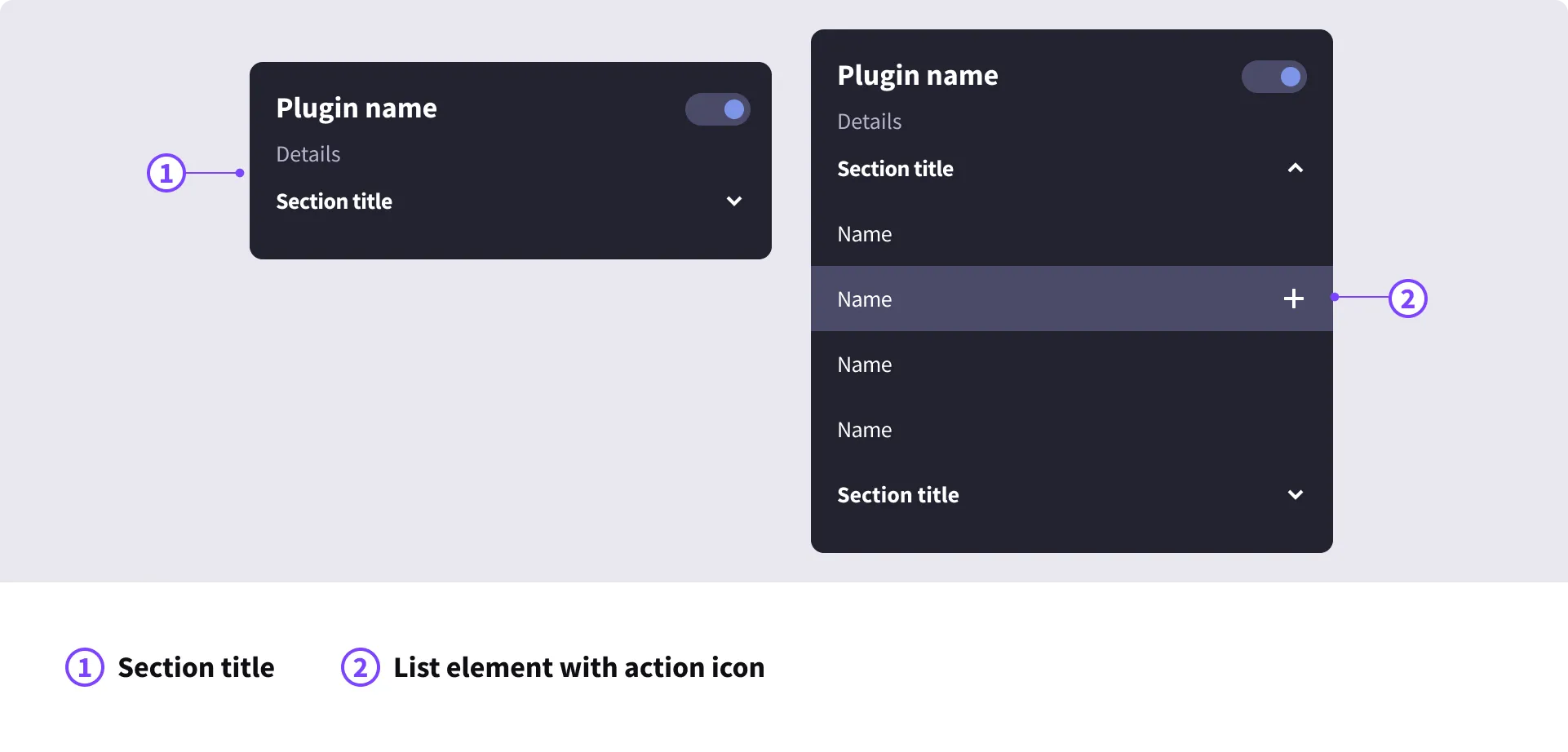
Contained list
Section titled “Contained list”- The content is dynamic but the length or the container is fixed. These lists may feature a scroll bar to browse through all items.
- The list items may have one or several interactive elements, such as a button, icon, checkbox or toggle.
- We recommend limiting, when possible, to one interactive element per list item.
- We allow a maximum of 3 interactive elements per list item.
- They are good to use when space is limited.
- Fill contained lists in the Grey 450 color in the default state.